Google Gemini app gets colourful icon on Android and iPhone: What is new
Gemini app now features a redesigned icon in Google's classic red, blue, green, and yellow colours, which gives it a fresh look on Android and iPhone
Sweta Kumari New Delhi Google has updated the icon for its
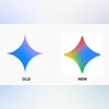
Gemini app on both Android and iPhone, giving it a fresh and colourful new look. According to a report by 9To5Google, the latest update replaces the older design with a logo that used the same colour style which was used in other popular Google apps. The Blue is the predominant hue at the right, while the other colour points are red, yellow, and green.
In April, Google updated the Gemini app icon on Android and iOS, making the blue more prominent, the overall look brighter, and the icon slightly larger. Later, a red version was introduced for AI Pro subscribers to mark it as a distinct part of Gemini. The visible changes in the icon of Gemini are:
Four colours, one design
As per the report, the new icon features Google’s four signature colours – blue, red, yellow, and green. The blue section remains on the right side, while the other colours form rounded points around it. The shape is also smoother and less sharp than before. There is also a gradient effect at the left side.
Improved visibility on home screens
One noticeable change is how the icon looks on your phone's home screen. It now appears bolder and clearer, even when displayed at a small size. The design does not have the thin lines, which can often fade or become hard to see on smaller screens.
Filling the space better
Another improvement is that the icon now takes up more space inside the white circular background. This makes it easier to spot and gives it a more balanced look. The updated design also includes a slight gradient, which gives it a touch of depth similar to Google’s main “G” logo.
Part of the Google family
This change helps Gemini feel more connected to the Google family of apps. With this new icon, Gemini fits right in with apps like Google Maps, Gmail, and Chrome, which also use the same four-colour style. The unique sparkle shape still makes it stand out enough to avoid confusion with other apps.
While the icon is now live on both Android and iPhone, users are still waiting for the same update to appear on the web version of Gemini.
 "Google Gemini app gets colourful icon on Android and iPhone: What is new")