Google Gemini web revamp brings 'My Stuff' hub and dark mode: What's new
Google updates the Gemini on the web with a dark theme, a cleaner layout, and a new 'My Stuff' section that stores your images, videos and creations
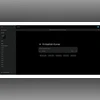
Sweta Kumari New Delhi Google has started rolling out a redesign for Gemini on the web, following the updates made to its Android and iOS versions last month. According to a report by 9To5 Google, the company aims to give Gemini a clean, modern look. The greeting on the homepage has now changed from “Hello” to “Hi,” paired with the Gemini spark icon on the left. Earlier, the website only showed the logo as a favicon. There is also a small visual touch, a rotating animation that appears when the page first loads. Alongside these changes, Google has added several upgrades to Gemini on the web. Here are these:
Gemini on web: What’s new
My Stuff folder
A new addition is the “My Stuff” folder inside the navigation drawer. This section gives users one place to find all the images, videos, Canvas creations, and other outputs generated through Gemini. The folder shows three recent items as rounded previews, and tapping on them opens a full-screen view at gemini.google.com/mystuff. These previews sit alongside existing categories like Gems and Chats. This is expected to make it easier to revisit past creations without scrolling through old conversations.
Prompt box
According to the report, the prompt box has been updated as well. It no longer sits inside a faintly outlined container, giving the layout a more open feel. The suggestion pills that appear below it are now centred, making the interface look more balanced.
Plus menu
Apart from the visual changes, gemini.google.com recently added a Google Photos picker to the ‘plus’ menu, similar to the Drive. This means users can directly pull images from their Google Photos library instead of downloading them first and then uploading them into Gemini.
Homepage background
The redesign also brings adjustments to the dark and light themes. On the homepage, the dark mode switches from a gray background to solid black. However, the prompt box and the navigation rail or drawer keep their original colour. The light theme is slightly darker than before, but Google has not modified how conversations appear in either mode.
 "Google Gemini web revamp brings 'My Stuff' hub and dark mode: What's new")