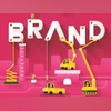
When corporate rebranding backfires: Lessons from past successes and flops
The 200-year-old company is now called aberdeen group, effectively reversing a decision to rebrand as abrdn in 2021 in a bid to pitch itself as a modern, agile, digitally-enabled brand
 "Branding, endorsements, campaign, brand, advertisement, ad")
Over the years, there have been several failed rebranding efforts. In 2009, PepsiCo U-turned less than two months after Tropicana. | File Image
Listen to This Article
Jenny Gross
Hw cn brnds sty cl? Nt by drpping vwls, one of Britain’s biggest investment firms concluded this week, when it announced it was adding back the “e’s” to its name four years after dropping them.
The 200-year-old company is now called aberdeen group, effectively reversing a decision to rebrand as abrdn in 2021 in a bid to pitch itself as a “modern, agile, digitally-enabled brand.” The decision four years ago was widely ridiculed. Jason Windsor, who took over as chief executive last year, said on Tuesday that it was time to “remove distractions” — less than two months after saying he had no plans to change the name.
Corporate rebrands can be critical to signifying a strategy shift but they also come with risks when companies veer too far from their purpose. Aberdeen’s vowel-dropping rebrand was just the latest example of a company reversing course after a new name failed to lift its performance or its reputation with customers.
The perils of chasing trends
Also Read

 "The influencer economy: Macro, micro, and nano world of influencers")
 "In 2023, at just 18, R Praggnanandhaa made history by becoming the youngest Indian to compete in the prestigious Candidates Tournament, a key event leading up to the World Chess Championship. His participation underscores India's rapid rise in chess.")
 "India's tech startup boom: Are policy tweaks needed to drive growth?")
 "Donald Trump, Trump")
 "ICC Champions Trophy winners list along with their captains")
Removing vowels from brand names or using a name with a deliberately misspelled word was not uncommon in the 2000s, especially among trendy technology companies. Businesses including Grindr, Flickr, Tumblr, and even twttr, as Twitter (now X) was initially called, embraced the aesthetic. But today, that style can look out of date and embarrassing, said Laura Bailey, a senior lecturer in linguistics at the University of Kent.
Often, when companies try to appear trendy, “by the time they get to it, it’s been around for too long,” Bailey said. When it comes to financial companies, she added, another aspect to consider is: Do these businesses want to be cool, or should they go for a name that projects security and responsibility?
A history of rebranding misses (and some hits)
Over the years, there have been several failed rebranding efforts. In 2009, PepsiCo U-turned less than two months after Tropicana, its juice brand at the time, introduced new packaging that featured a glass of orange juice instead of its famous orange with a straw poking out of it. Angry customers described the new look as “ugly” and resembling “a generic bargain brand.”
A year later, Gap took even less time to reverse course after unveiling a widely panned new logo for its stores that dropped the famous white lettering on a blue background that the brand had used for decades. The retailer took about a week to go back to its original rendering. “OK,” the company said in a statement. “We’ve heard loud and clear that you don’t like the new logo.”
Some corporate rebrands have been effective. In 2012, Kraft Foods chose Mondelez International as the new name for its snacking business — which includes brands such as Oreos and Philadelphia cream cheese — from nearly 2,000 names suggested by employees. “Mondelez” was an invented word that combined “monde,” the French word for “world,” and “delez,” a made-up word intended to suggest “delicious.” So, “delicious world.”
In 2001, Andersen Consulting became Accenture after splitting from Arthur Andersen, the accounting firm. The new name was chosen from 5,500 options, which were whittled down to 500 and then 10 before the firm eventually went with Accenture “because it implies accent on the future,” The New York Times reported at the time. Despite some scepticism, the brand has endured and the company has grown into a consulting behemoth with a stock market capitalisation of about $215 billion.
HIT OR MISS
nPepsiCo U-turned less than two months in 2009 after its juice brand at the time Tropicana introduced new packaging
nGap in 2010, dropped the logo that it had used for decades but reversed course within a week after customers’ dismay
nIn 2012, Kraft Foods chose Mondelez International as the new name for its snacking business — which includes Oreos
nIn 2001, Andersen Consulting became Accenture after splitting from Arthur Andersen and has now grown into a consulting behemoth with a mcap of about $215 billion.
More From This Section
 "Elon musk, musk, Elon")
 "The rupee on Friday depreciated to a new intraday low of Rs 83.76 against the US dollar during the day because selling in equities and domestic demand for the dollar from importers offset the gains from the weaker greenback, said dealers.")
 "Gaza, Israel-Gaza, Palestine")
 "Israel, Hamas, Israel Hamas flag, Israel Hamas")
 "Arnold Su, Vice President, Consumer & Gaming PC, System Business Group, Asus India")
Topics : Branding Branding of products brands marketing
Don't miss the most important news and views of the day. Get them on our Telegram channel
First Published: Mar 09 2025 | 11:32 PM IST